Rate of Change Comparisons Between SEACAR & Older Dataset
This analysis compares rate of change for each station+parameter as calculated from the old and new datasets. Only slopes with significant p-values for in both datasets are considered in this analysis.
define getRateOfChangeParameters
library(here)getRateOfChangeParameters <-function(){# read filenames from data/exports/parameterRateOfChange*.csv seacar_files <-list.files(here("data/exports/parameterRateOfChange"), pattern =".*\\.csv", full.names =TRUE)# extract parameter names from filename basename seacar_parameters <-basename(seacar_files) seacar_parameters <-sub(".csv", "", seacar_parameters)# read filenames from data/seasonal-mann-kendall-stats/*.csv old_files <-list.files(here("data/seasonal-mann-kendall-stats"), pattern =".*\\.csv", full.names =TRUE)# extract parameter names from filenames old_parameters <-basename(old_files) old_parameters <-sub(".csv", "", old_parameters)# return list of parameters that exist in either datasetreturn(union(seacar_parameters, old_parameters))}
calculate differences in rate of change at each station
library(dplyr)library(glue)source(here("SEACARProgramCompare/mapProgramNameToShortName.R"))# create empty data frame to store resultsrate_of_change_comparison <-data.frame()missing_seacar_parameters <-c()missing_old_parameters <-c()for (parameter ingetRateOfChangeParameters()){# Read in the rate of change files seacar_rate_of_change <-tryCatch({read.csv(here("data/exports/parameterRateOfChange", glue("{parameter}.csv"))) %>%mutate(ProgramLocationID =as.character(ProgramLocationID),ProgramName =mapProgramNameToShortName(ProgramName) ) %>%filter(!is.na(significant_slope)) }, error =function(e){ missing_seacar_parameters <<-c(missing_seacar_parameters, parameter)# print(e)NULL }) old_rate_of_change <-tryCatch({read.csv(here("data/seasonal-mann-kendall-stats", glue("{parameter}.csv"))) %>%mutate(ProgramLocationID =as.character(site),ProgramName =mapProgramNameToShortName(source) ) %>%filter(!is.na(significant_slope)) }, error =function(e){ missing_old_parameters <<-c(missing_old_parameters, parameter)# print(e)NULL })# Skip if either file is missingif (is.null(seacar_rate_of_change) ||is.null(old_rate_of_change)) {# cat('!')next }# Compare the rate of change at each station seacar_rate_of_change %>%inner_join(old_rate_of_change, by =c("ProgramLocationID", "ProgramName")) %>%mutate(slope.new = significant_slope.x, # from seacar_rate_of_changepvalue.new = pvalue.x,n_values.new = n_values.x,slope.old = significant_slope.y, # from old_rate_of_changepvalue.old = pvalue.y,n_values.old = n_values.y,rate_of_change_diff = significant_slope.x - significant_slope.y,# keep only columns we needProgramName = ProgramName,ParameterName = parameter,ProgramLocationID = ProgramLocationID,.keep ="none" ) -> current_comparison# append to results rate_of_change_comparison <-rbind(rate_of_change_comparison, current_comparison)# cat('.')}cat('\n\nMissing SEACAR parameters:', paste(missing_seacar_parameters, collapse =', '))
calculate differences in rate of change at each station
cat('\n\nMissing old parameters:', paste(missing_old_parameters, collapse =', '))
Missing old parameters: Ammonium (NH4), Colored Dissolved Organic Matter, Light Extinction Coefficient, Nitrogen, inorganic, Secchi Depth, Total Ammonia (N)
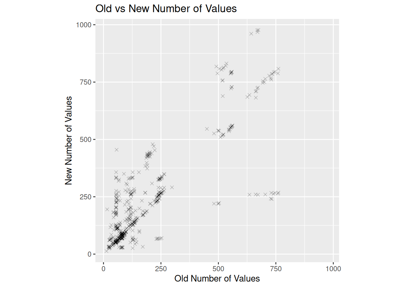
Change in the number of values used to calculate slopes
Slopes calculated with fewer values are less reliable. The new data source is expected to have a higher n_value at each station.
n_values old vs new correlation
A line with slope 1 would indicate no change in the number of values used to calculate slopes. Data points above this line indicate an increase in the number of values used to calculate slopes. Points are expected to be above the diagonal because the new dataset has more points than the old dataset.
plot scatter plot of old vs new n_values
library(ggplot2)# Calculate the range for both axesmax_slope <-max(c(rate_of_change_comparison$n_values.old, rate_of_change_comparison$n_values.new), na.rm =TRUE)min_slope <-min(c(rate_of_change_comparison$n_values.old, rate_of_change_comparison$n_values.new), na.rm =TRUE)ggplot(rate_of_change_comparison, aes(x = n_values.old, y = n_values.new)) +geom_point(shape=4, alpha=.2) +coord_equal(xlim =c(min_slope, max_slope), ylim =c(min_slope, max_slope)) +labs(title ="Old vs New Number of Values",x ="Old Number of Values",y ="New Number of Values")
Some station points can form lines parallel to the 1:1 line. These lines represent a set of stations that have added a similar number of points to the time series. It is likely these points from the same data provider.
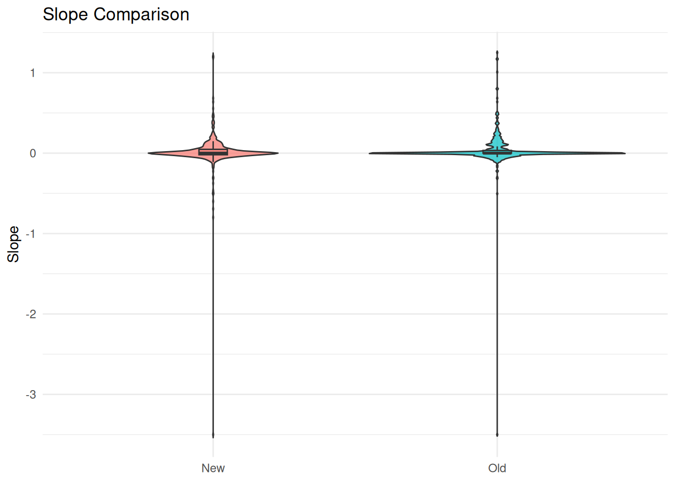
Rate of Changes from slope.old and slope.new
The slopes calculated are expected to form a normal distribution around 0, with little change between the old and new data.
violin plot of slope.old and slope.new
library(ggplot2)library(tidyr)# Reshape to long formatdf_long <-pivot_longer(rate_of_change_comparison, cols =c(slope.old, slope.new), names_to ="version", values_to ="slope")ggplot(df_long, aes(x = version, y = slope, fill = version)) +geom_violin(trim =FALSE, alpha =0.7) +geom_boxplot(width =0.1, outlier.shape =NA, alpha =0.5) +scale_x_discrete(labels =c("slope.new"="New", "slope.old"="Old")) +labs(title ="Slope Comparison", x =NULL, y ="Slope") +theme_minimal() +theme(legend.position ="none")
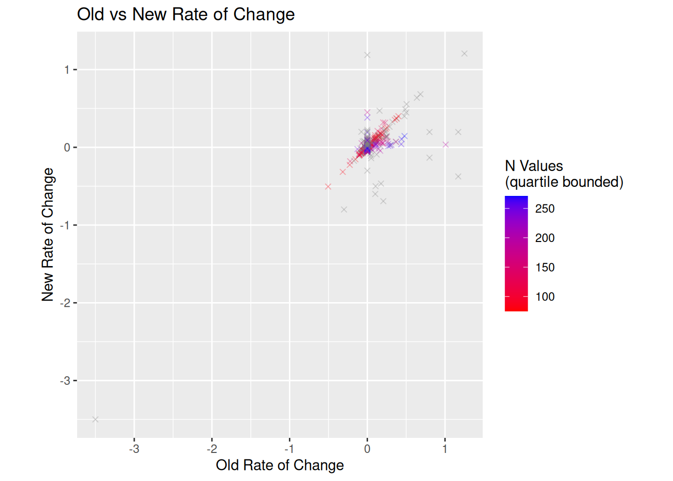
New vs Old Slopes
New vs Old Slopes Correlation
Slopes calculated from the new and old data should be highly correlated. Slopes with lower n_values are more likely to be spurious.
plot scatter plot of old vs new rate of change
library(ggplot2)# Calculate the range for both axesmax_slope <-max(c(rate_of_change_comparison$slope.old, rate_of_change_comparison$slope.new), na.rm =TRUE)min_slope <-min(c(rate_of_change_comparison$slope.old, rate_of_change_comparison$slope.new), na.rm =TRUE)# Calculate quartiles for color scalecolor_min <-quantile(rate_of_change_comparison$n_values.new, 0.25, na.rm =TRUE)color_max <-quantile(rate_of_change_comparison$n_values.new, 0.75, na.rm =TRUE)ggplot(rate_of_change_comparison, aes(x = slope.old, y = slope.new)) +# color by n_valuesgeom_point(aes(color = n_values.new), shape=4, alpha=.3) +scale_color_gradient(low ="red", high ="blue", limits =c(color_min, color_max)) +coord_equal(xlim =c(min_slope, max_slope), ylim =c(min_slope, max_slope)) +labs(title ="Old vs New Rate of Change",x ="Old Rate of Change",y ="New Rate of Change",color ="N Values \n(quartile bounded)")
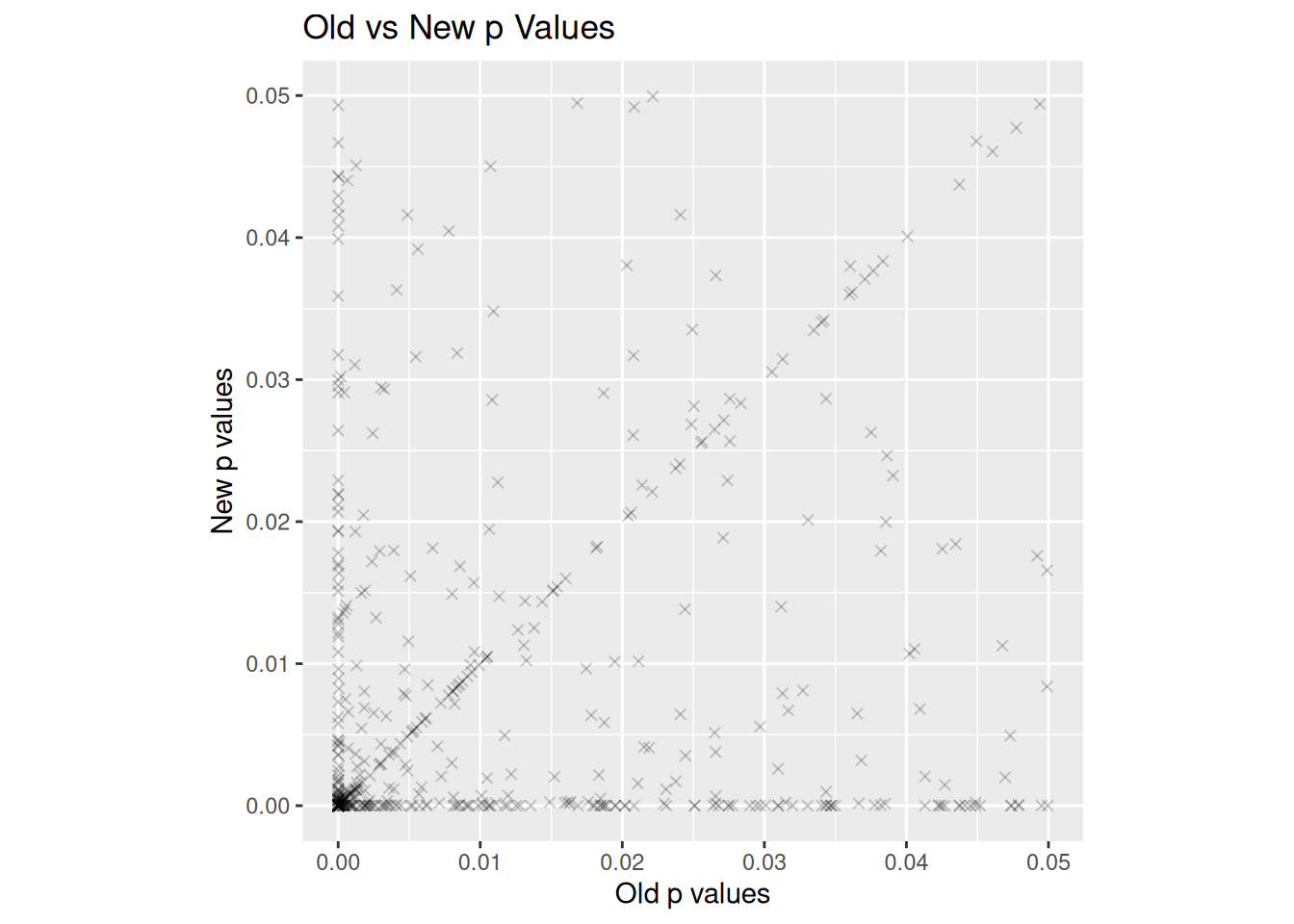
New vs Old p-values
The p-values calculated from the new and old data should be highly correlated. The p-values should become more significant (lower) as more data is added, so the majority of points should be below the diagonal.
plot scatter plot of old vs new significances
library(ggplot2)# Calculate the range for both axesmax_slope <-max(c(rate_of_change_comparison$pvalue.old, rate_of_change_comparison$pvalue.new), na.rm =TRUE)min_slope <-min(c(rate_of_change_comparison$pvalue.old, rate_of_change_comparison$pvalue.new), na.rm =TRUE)ggplot(rate_of_change_comparison, aes(x = pvalue.old, y = pvalue.new)) +geom_point(shape =4, alpha=.2) +coord_equal(xlim =c(min_slope, max_slope), ylim =c(min_slope, max_slope)) +labs(title ="Old vs New p Values",x ="Old p values",y ="New p values")
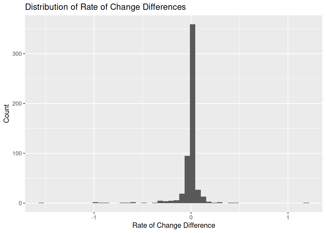
Rate of Change Differences
The rate of change differences should be normally distributed around 0.
plot distribution of rate of change differences
library(ggplot2)ggplot(rate_of_change_comparison, aes(x = rate_of_change_diff)) +geom_histogram(bins =50) +labs(title ="Distribution of Rate of Change Differences",x ="Rate of Change Difference",y ="Count")
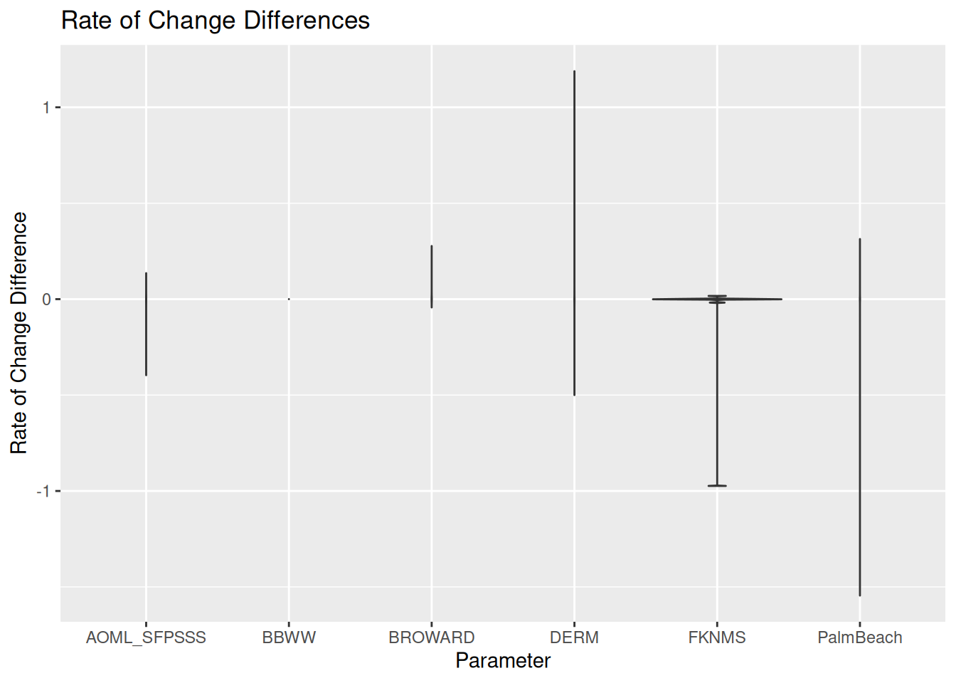
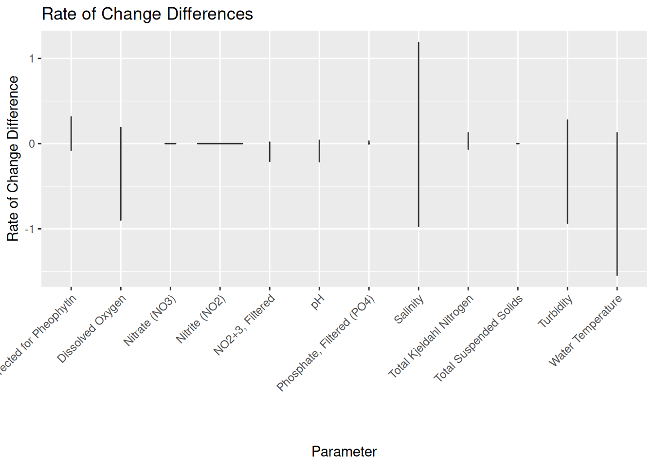
Rate of Change Change Across Facets
Rate of change differences may be related to differences from a subset of the data.
Rate of Change Change Across ProgramName Facet
violin plot of new vs old rate of change facet programName
library(ggplot2)ggplot(rate_of_change_comparison, aes(x = ProgramName, y = rate_of_change_diff)) +geom_violin() +labs(title ="Rate of Change Differences",x ="Parameter",y ="Rate of Change Difference")
Rate of Change Change Across ParameterName Facet
violin plot of new vs old rate of change facet parameterName
library(ggplot2)ggplot(rate_of_change_comparison, aes(x = ParameterName, y = rate_of_change_diff)) +geom_violin() +theme(axis.text.x =element_text(angle =45 , hjust =1)) +labs(title ="Rate of Change Differences",x ="Parameter",y ="Rate of Change Difference")
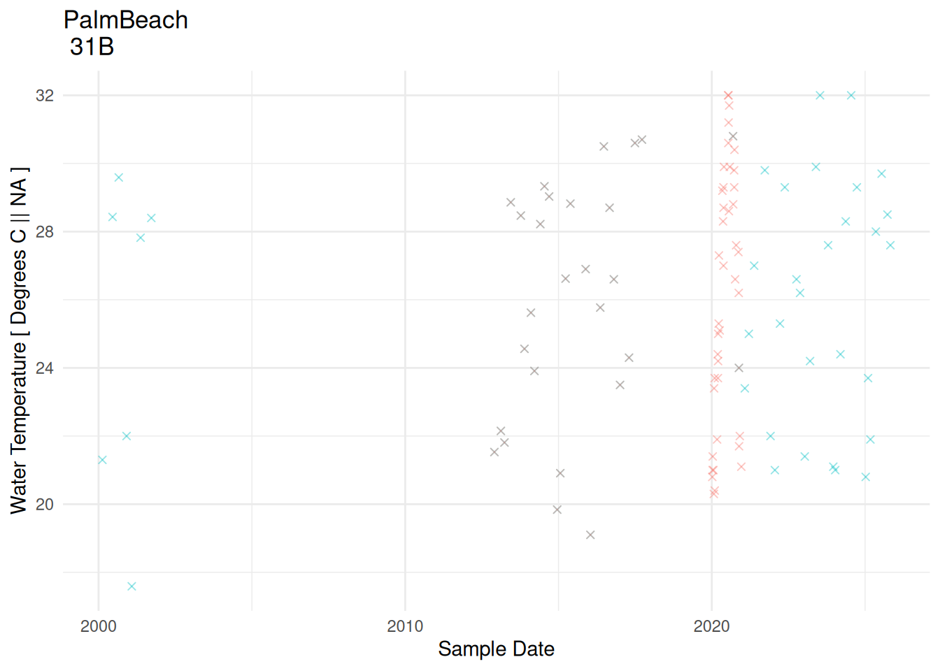
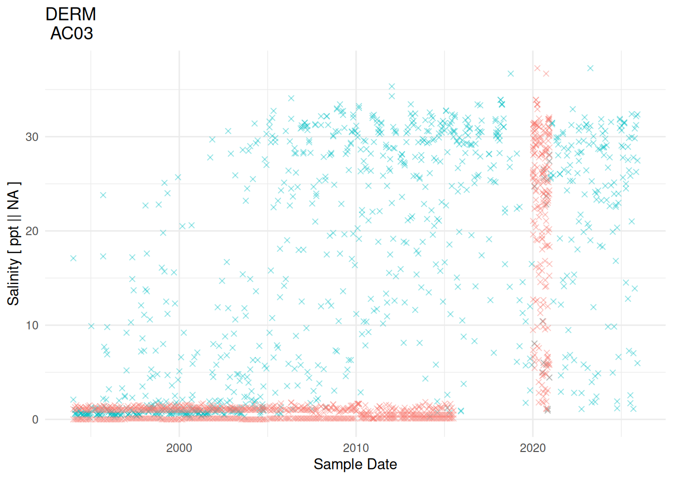
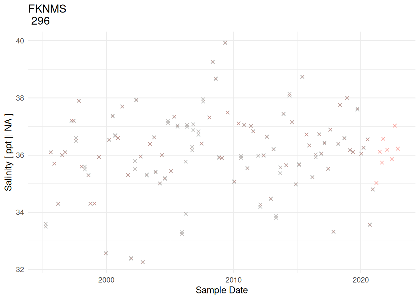
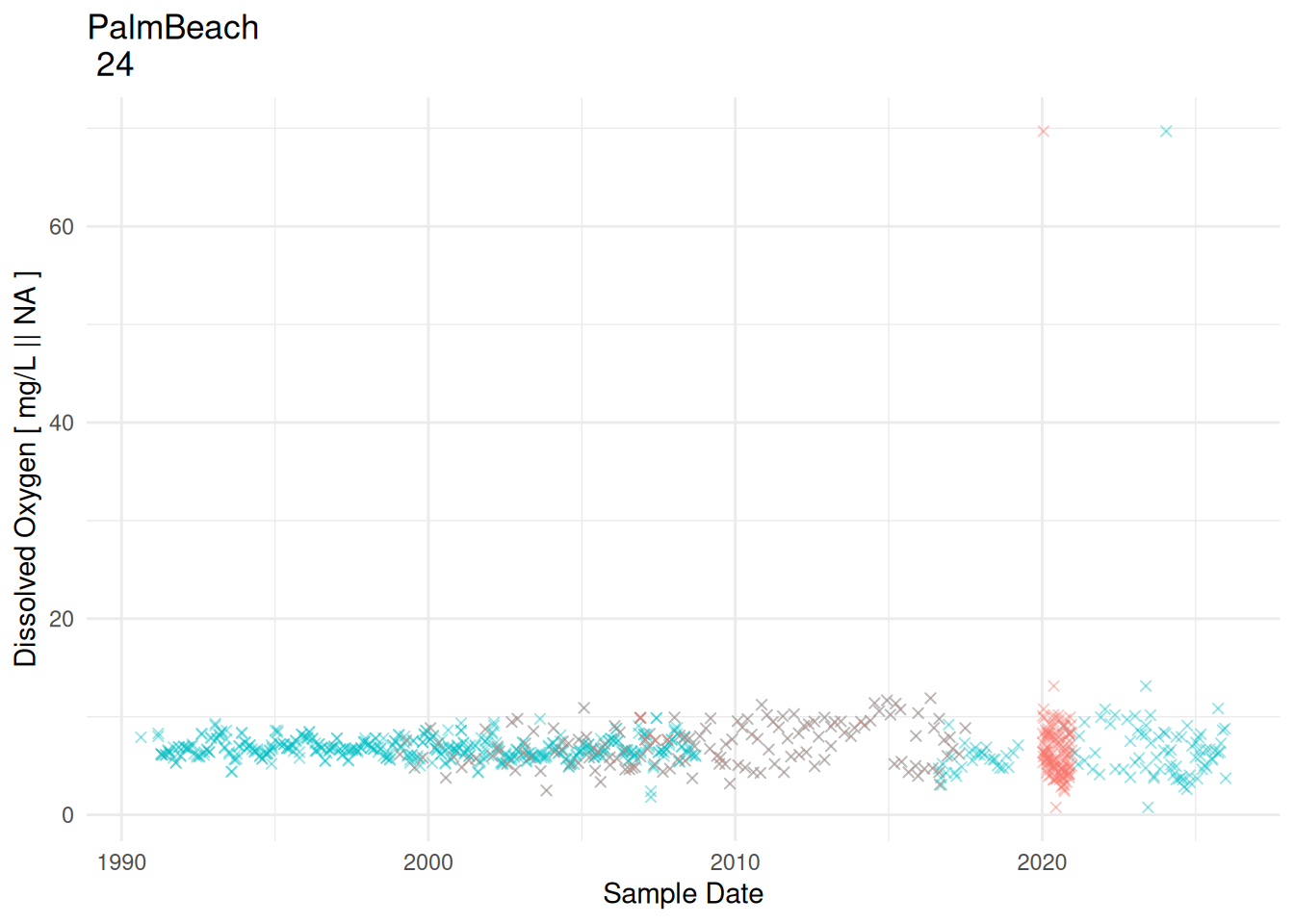
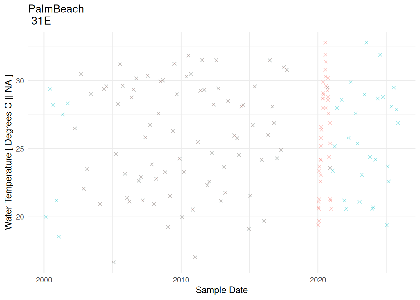
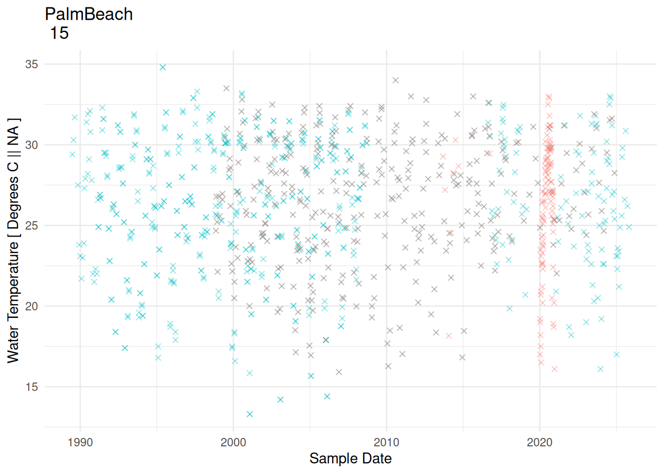
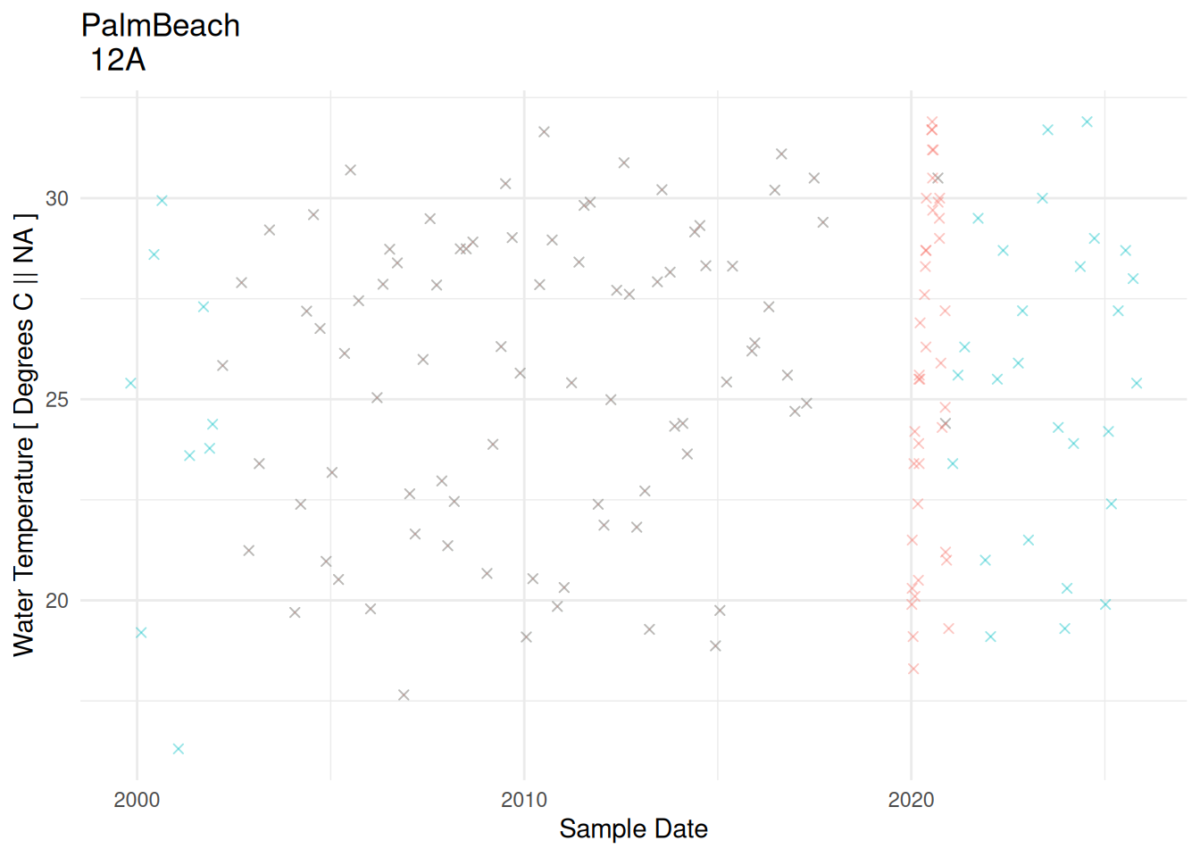
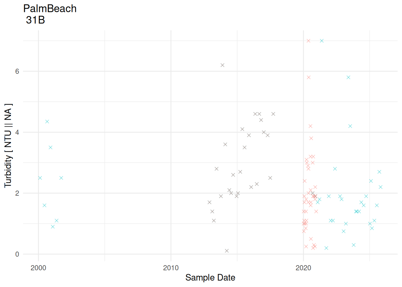
Top Differences
The most different rate of change differences are plotted below. New data is plotted in red and old data in blue.
plot time series of top differences
library(here)source(here("R", "getStationData.R"))source(here("R", "plotStationParameterTimeSeriesComparison.R"))# get top differencessubset_to_plot <- rate_of_change_comparison %>%ungroup() %>%arrange(desc(abs(rate_of_change_diff))) %>%head(10) # for each top diff, load the data and plotfor (i in1:nrow(subset_to_plot)) { station <- subset_to_plot$ProgramLocationID[i] parameter_name <- subset_to_plot$ParameterName[i] program_name <- subset_to_plot$ProgramName[i]# Get data for the station+parameter df_station <-getStationData(station) %>%filter( ParameterName == parameter_name )# get ParameterUnits for source = "SEACAR_STD" seacar_units <- df_station %>%filter(source =="SEACAR_STD") %>%pull(ParameterUnits) %>%unique() %>%first()# get ParameterUnits for source = "OLD_STD" old_units <- df_station %>%filter(source =="OLD_STD") %>%pull(ParameterUnits) %>%unique() %>%first()# Create plotprint(ggplot(df_station, aes(x = SampleDate, y = ResultValue, color = source)) +# point datageom_point(alpha =0.4, shape=4) +labs(title =paste(program_name, "\n", station),x ="Sample Date",y =paste(parameter_name, "[", seacar_units, "||", old_units, "]") ) +theme_minimal() +theme(legend.position ="none") )}
print station+parameter pairs with highest differences