Read data
# Load required libraries
library(tidyverse)
library(leaflet)
library(DT)
library(here)

# Read the data
df <- readr::read_delim(
  here("data/Discrete WQ - 10006.txt"),
  delim = "|"
) # Load required libraries
library(tidyverse)
library(leaflet)
library(DT)
library(here)
# Read the data
df <- readr::read_delim(
here("data/Discrete WQ - 10006.txt"),
delim = "|"
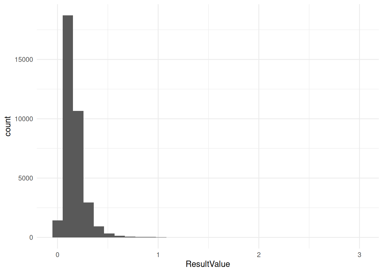
) filtered_data <- df %>%
filter(ProgramName == "Florida Keys National Marine Sanctuary Water Quality Monitoring Project") %>%
filter(ParameterName == "Total Nitrogen")ggplot(filtered_data, aes(x = OriginalLongitude, y = OriginalLatitude, color = ResultValue)) +
geom_point(alpha=0.1, shape=4) +
scale_color_gradient(low = "blue", high = "red", limits = c(0, 1)) +
theme_minimal()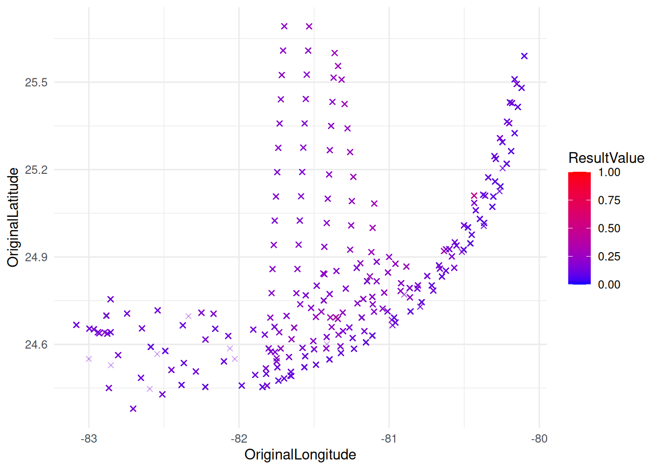
ggplot(filtered_data, aes(x = ResultValue)) +
  geom_histogram(bins = 30) +
  theme_minimal()